Greige Primary Bathroom Remodel in Greenville, SC
An outdated primary bathroom gains a more functional layout thanks to a frameless, walk-in shower and custom floor-to-ceiling cabinetry solutions. The classic style, combined with a timeless greige and cream color palette will last this well-loved family home another couple of decades. In addition, this couple chose some custom storage solutions that help keep them organized and their bathroom clutter-free.

Primary bathroom remodel with a gray and beige color scheme
Primary Bath Gallery


Primary Bath Remodel
You don’t have to look too far through our blog to see that we serve a fair amount of clients on Greenville’s Eastside. This side of Greenville has long been a popular area to live and work due to its close proximity to I-85 and I-385, hospitals, and good public schools. Clients on the Eastside vary from young families to established empty nesters.
Take these clients for example. They have lived in the same house for over 30 years located off of Greenville’s Pelham Road. An easy commute to work and the neighborhood’s large, shaded lots are what originally drew the couple to the home. However, Greenville has grown significantly over the past three decades, and what was once a sparse suburban neighborhood is now a central, well-located development. Our clients could easily sell their home and downsize their empty nest, but prefer to stay put and update room-by-room. Not only does staying in their current house save them from the cost and hassle of moving, but gives them the freedom to optimize a home they already love and have decades of family memories in. Today, their adult children are raising their own families nearby, and enjoy spending many afternoons and weekends at their childhood home.
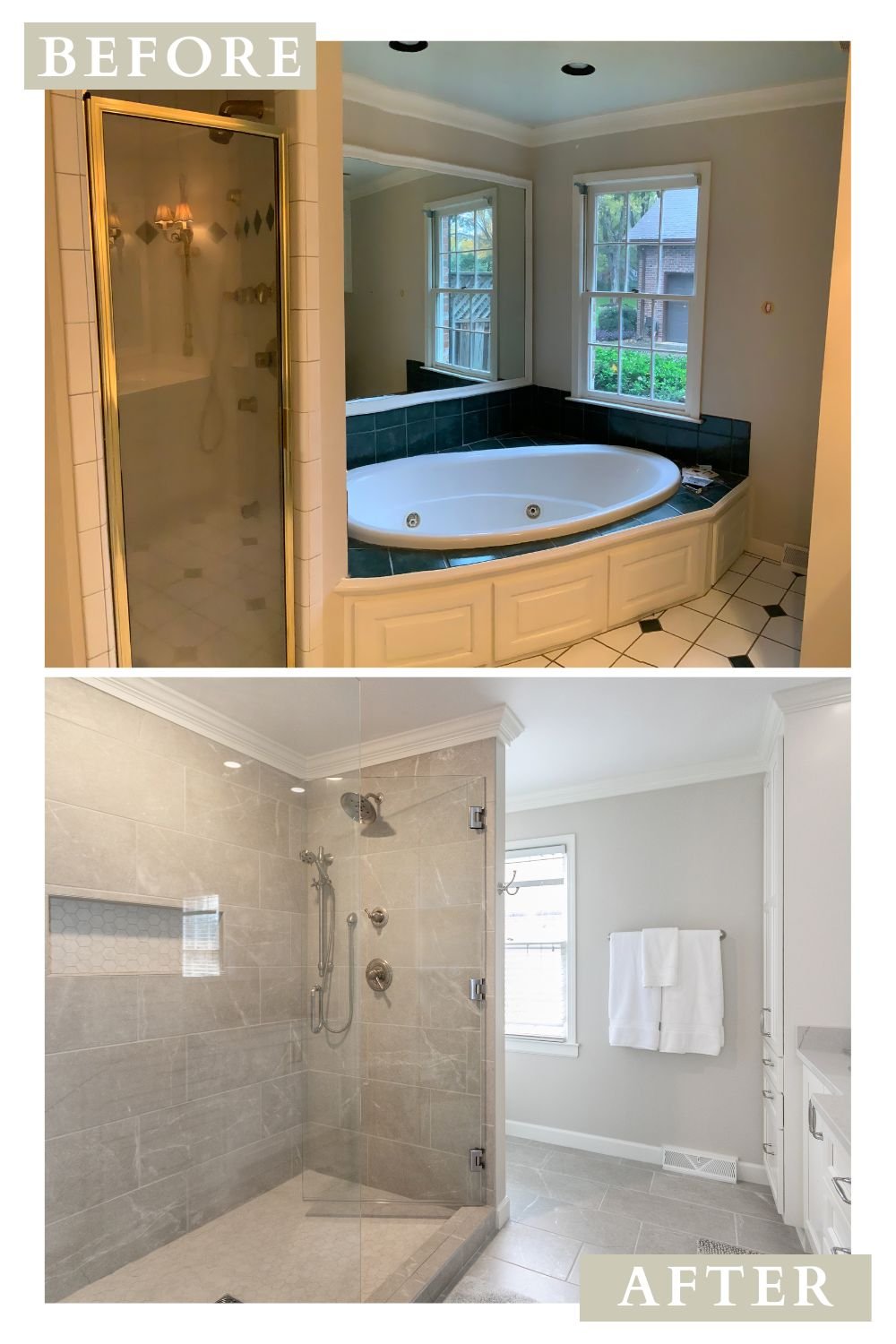
Our clients’ master bathroom was original to their 1980s home. The bathroom’s square footage wasn’t small by any means, but the original layout left the space boxy and sectioned off. The original bathroom had a barely used, whirlpool tub that took up the entire corner of the bathroom. While the shower, which is used everyday, was squeezed between the oversized tub and wall. The toilet was in an alcove to the left of the double sink vanity, and didn’t offer much by way of space or privacy.
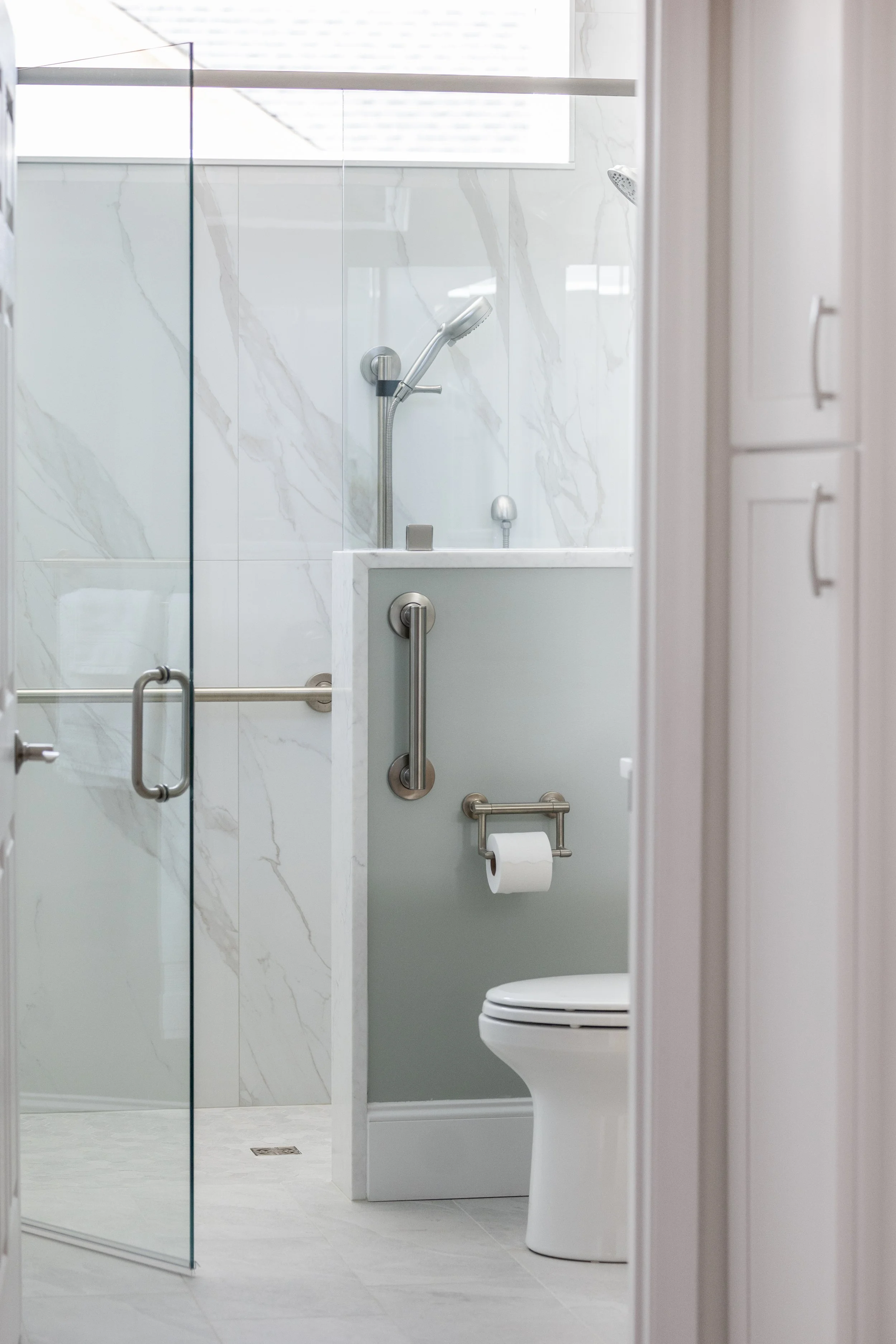
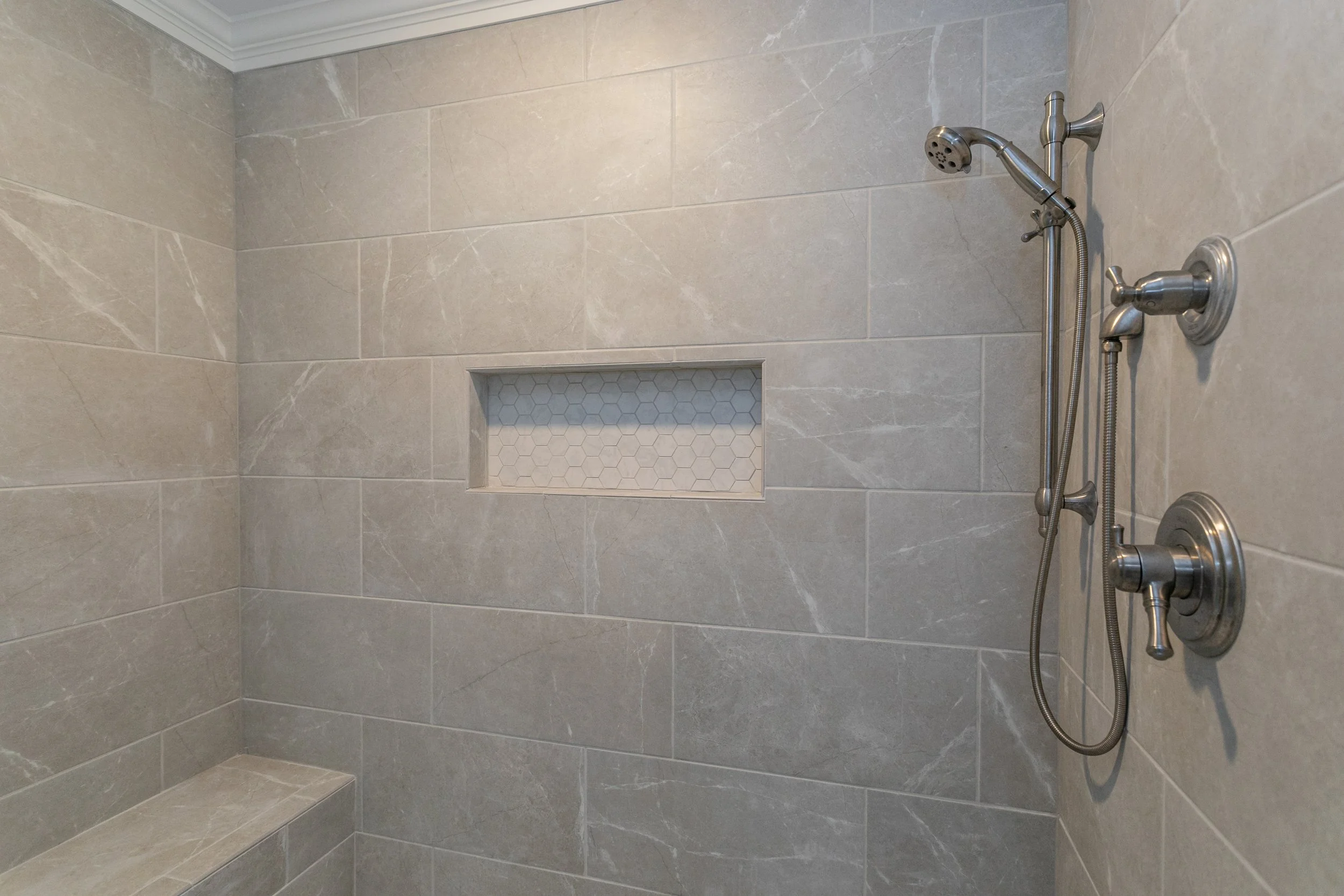
Our team got to work to update this primary bathroom. First, the tub had to go. Our clients rarely used it, and it took up a third of the bathroom’s floor space. They chose to do away with the bathtub completely instead of replacing it with a more contemporary, freestanding model. With the whirlpool out of the way, our team expanded the shower. The new, frameless, walk-in shower offers our clients a built-in niche and bench seat. Utilizing the same large format tile on the bathroom floor as the shower walls gives the space a more cohesive feel. Not to mention, larger tile means less grout, and less grout means easier clean-up! The shower is now the focal point of the space instead of being small, dark, and closed off.
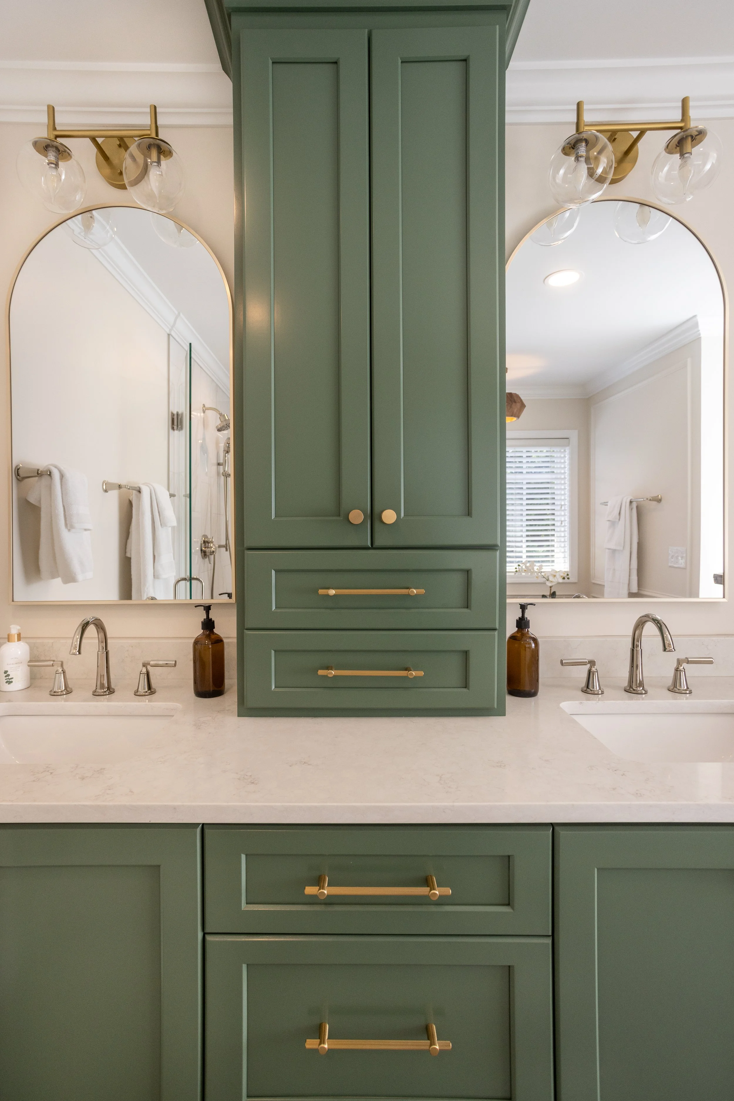
Keeping a double sink vanity in the couple’s bathroom was a “must” on their list. However, the original bathroom layout didn’t offer much storage space. Our team solved this problem by going vertical. The custom, central medicine counter not only serves to visually balance the vanity, but is a practical solution to keep the counters clutter-free. The toilet was previously located to the left of the vanity. Our team relocated the commode to the right of the new shower, and put a custom floor-to-ceiling linen closet in its place. Now, our clients have all their towels and toiletries within arm’s reach.
As mentioned before, our clients’ toilet was offered neither space nor privacy in its original spot. It is now out of view to the right of the newly expanded shower. A custom storage cabinet above the commode keeps toilet paper and other necessities within reach and out of sight.
At Ashmore Builders, we believe that the details are what turn beautiful designs into practical and functional spaces that improve our clients’ homes and lives. One way we like to optimize our clients’ new cabinets is by installing sliding shelves. That way, our clients can pull out the shelf to see what's in the back of the cabinet instead of pulling everything off of the shelf. This may seem like a minute detail, but saves our clients time and money in the long run by preventing them from buying double or letting their products go to waste. Not to mention, the time saved by not having to put everything back where it belongs. In addition, soft close hinges and tracks keep fingers from getting pinched, and doors from being slammed. This design choice may seem a bit superfluous, but actually extends the life of the cabinets and doors by preventing years of compounded wear and tear.
Do you have a space in your home that needs an upgrade?
Contact Ashmore Builders today to receive a beautiful, functional custom design that improves your day-to-day life and adds value to your home.
Before and After

Selections
Shower walls and bathroom floor are 12” x 24” in Grigio by B&F Ceramics Showroom. Selected through Clayton Tile.
Niche and shower floor are 2” hexagonal tile in Carrara White by GBI. Ordered through Clayton Tile.
Cabinets are painted White Dove (OC-17) by Benjamin Moore.
Walls are Benjamin Moore Edgecomb Gray (HC-173).
Quartz countertops are Cambria Ella.
Photos by Kim DeLoach Photography.