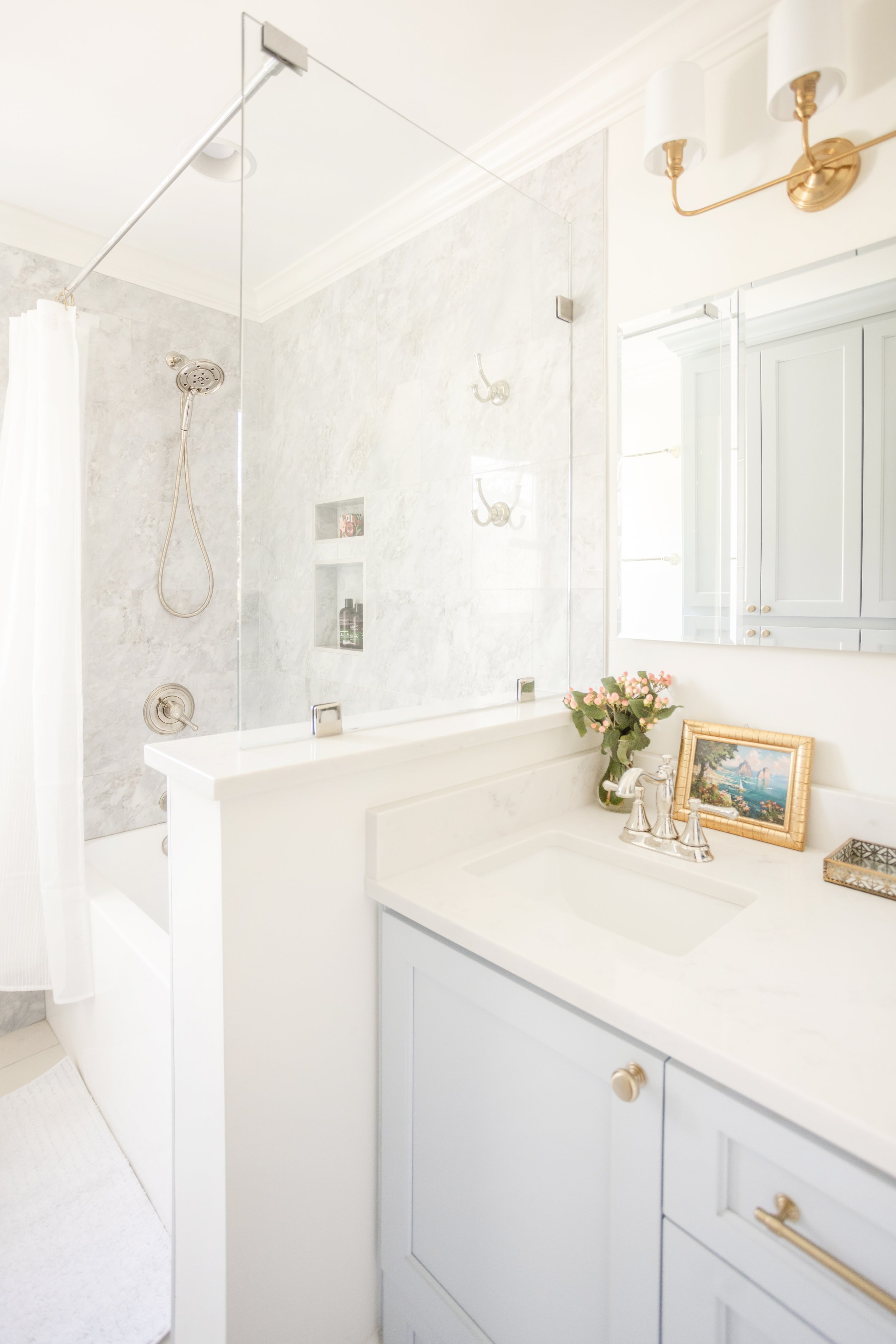
Pelham Falls Family Kitchen Remodel
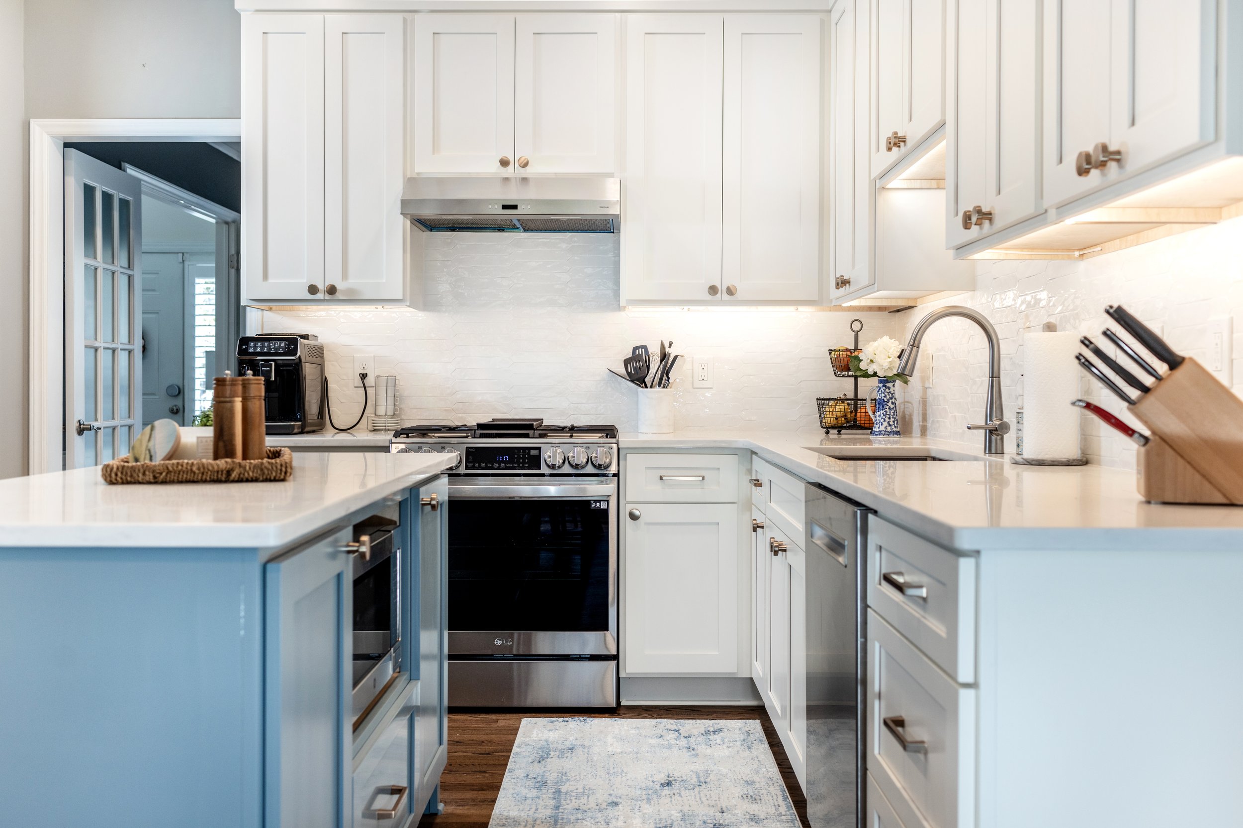
The home had everything our clients were looking for, but it was time for the kitchen to get an upgrade to better suit this growing family’s taste. The original white cabinets and black countertops were updated to a more classic style, a central island centers the space, and a picket tile backsplash adds a contemporary touch to the overall look.

An eat-in kitchen gets a timeless renovation that this young family can grow into.
The Neighborhood
Our clients approached us with a home in Greer’s Pelham Falls neighborhood. This community snakes around the Enoree River, has large, shaded lots, a nature trail, and river access. Not to mention, it’s within minutes to I-85 and the Greenville-Spartanburg International Airport. Close proximity to good public schools, local restaurants, and shopping are just the icing on the cake for this established neighborhood in eastern Greenville County. Many of our clients are young professionals looking to put down their roots. We may be biased, but Greenville’s proximity to the mountains and lakes, bustling downtown, and ever-growing business sector are some pretty appealing factors to consider when choosing where to establish a career and raise a family.
The Design
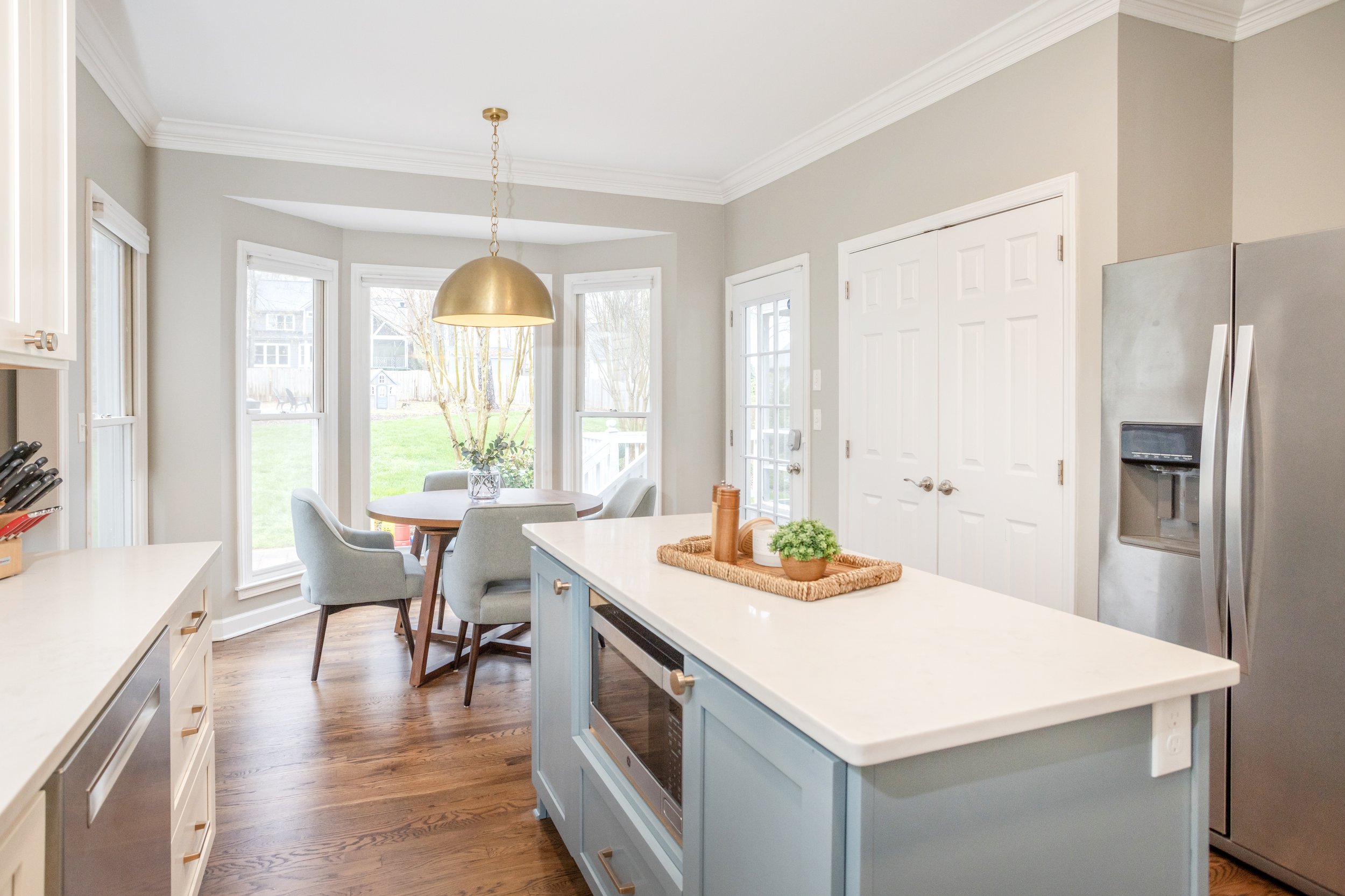
It was time for this kitchen’s 1990s era, white cabinets to get a revamp. Our clients chose a new door profile with a classic beading detail that will last this home another thirty years. Champagne bronze pulls and knobs add a subtle brightness to the gray kitchen walls, and complement this eat-in kitchen’s pendant light over the dining table. The kitchen’s original, black, granite countertops may have been good for hiding crumbs and spills, but the dark color left the space feeling dreary– despite having ample light from the kitchen’s bay window. Our clients chose a light gray quartz from Granite Top Designs to keep this kitchen’s look light and bright.
The original kitchen layout had a peninsula separating the kitchen’s prep and dining areas. Our clients chose to remove the bar and replace it with a central island. The new island helps balance the space, while simultaneously adding a pop of blue in Benjamin Moore’s Water’s Edge. Relocating the microwave from above the stove to below the island helps reduce spills and burns; while also keeping the appliance out of sight. Our clients not only gained storage, but also have a more functional workspace.
The kitchen’s white, subway tile backsplash got a contemporary twist by replacing the standard brick lay pattern with a horizontally stacked, white, picket tile. The subtle change in tile puts a contemporary spin on our clients’ new transitional kitchen design.
Our clients come to us from all phases of life with different wants and needs. Some remodels are more aesthetic; while others require a complete overhaul. It’s always an honor to be trusted with our clients’ homes, and it's our mission is to provide them a top-quality, custom product that suits their families for years to come.
Kitchen Remodel Gallery
Before and After
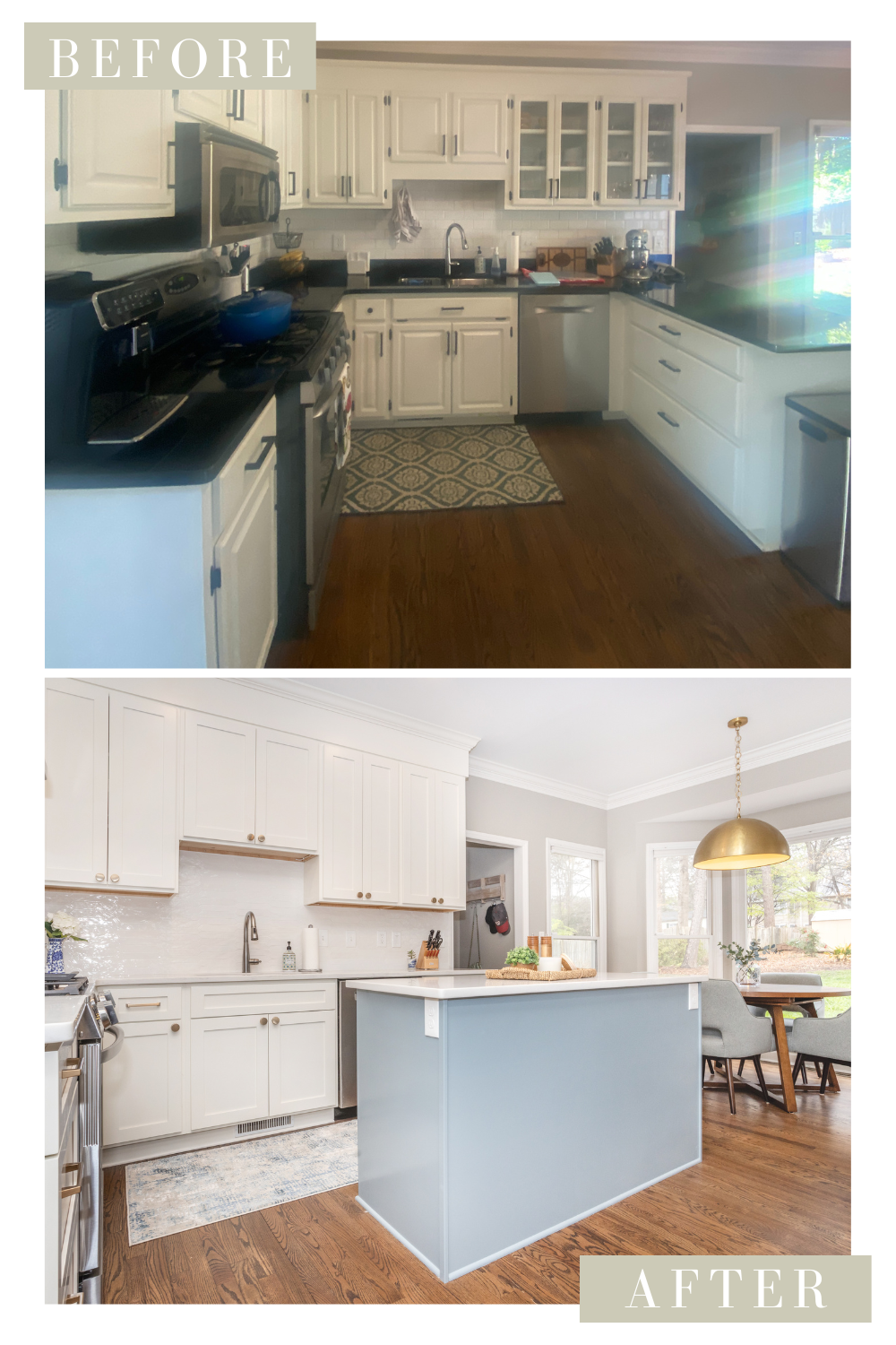
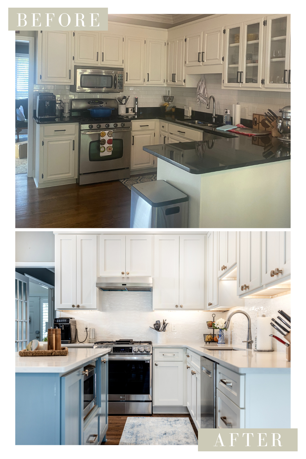
Selections
White gloss picket tile from Clayton Tile.
Amerock pulls and knobs in champagne bronze by Ferguson.
Quartz countertops in “Shadow” sourced through Granite Top Designs.
Island painted Benjamin Moore Water’s Edge.
Related Projects


