How to Choose the Best Neutral for Your Kitchen Remodel
The kitchen is the heart of the home. Selecting the right paint color for your kitchen remodel is a significant decision that sets the stage for the rest of your home’s interior design. Neutrals have long reigned supreme in kitchen paint selections for their versatility. However, moodier grays and earthy greens are gaining popularity as neutral paint options. In this blog post, we will guide you through five essential steps that will help you choose the perfect neutral paint color for your kitchen. In addition, discover how Ashmore Builders implemented a neutral, transitional style in our clients’ Greer, South Carolina kitchen remodel. We'll provide plenty of color samples from our own portfolio, as well as the most popular paint colors from industry leaders, Sherwin Williams and Benjamin Moore.
How to Choose the Best Neutral Paint Color for Your Kitchen: 5 Easy Steps
1. Determine Your Kitchen's Style:
The first step in choosing the perfect neutral paint color for your kitchen is to consider your kitchen's style. Different neutral shades work best with specific design aesthetics:
Modern kitchens are all about clean lines, minimalism, and a sense of spaciousness. When choosing the perfect neutral for your kitchen cabinets in a modern design, consider these options:
Crisp White: Crisp white cabinets create a sleek, open, and airy atmosphere in a modern kitchen. They reflect light beautifully and make the space feel expansive.
Charcoal Gray: Dark gray or charcoal cabinets can add a sense of drama and contrast in a modern kitchen. They pair well with stainless steel appliances for a contemporary look.
Matte Black: Matte black cabinets offer a striking and edgy appeal. They can make a bold statement in a modern kitchen design, especially when combined with sleek hardware and surfaces.
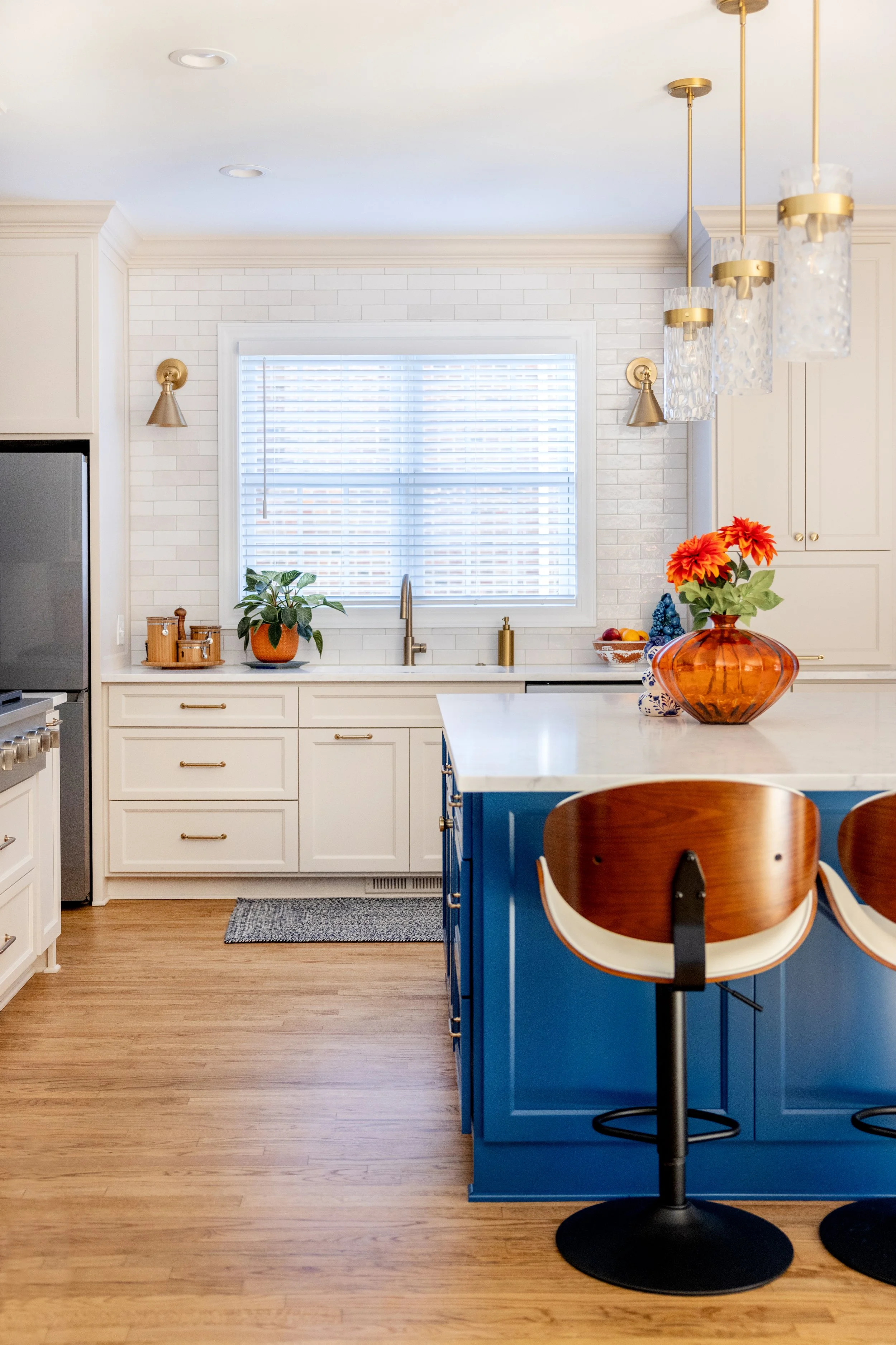
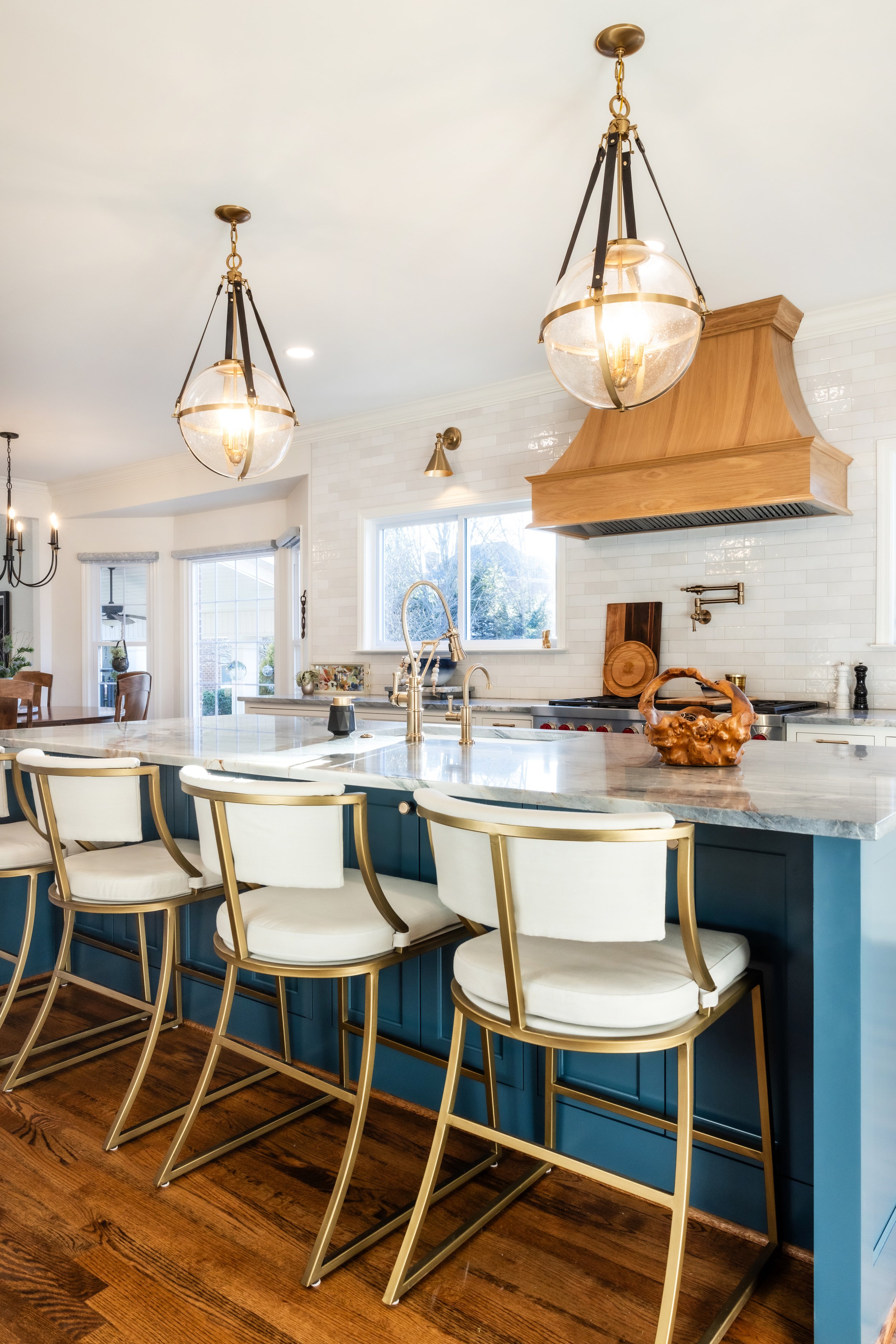
Pro Tip: Combining white cabinets with a dark gray or black island is a great way to add a contemporary touch without fully committing to a dark shade throughout your space. See this contemporary condo’s kitchen remodel or this modern and moody kitchen renovation for inspiration!
Traditional kitchens are known for their classic and timeless aesthetics. When it comes to choosing the perfect neutral for your kitchen cabinets in a traditional design, consider these options:
Creamy White: Creamy white cabinets exude a sense of warmth and comfort. They pair beautifully with rich, warm woods, creating a welcoming atmosphere reminiscent of a cozy, traditional kitchen. See this Spartanburg, SC kitchen remodel in Sherwin-Williams’ Pure White if you’re looking for a stately and classic look for your kitchen.
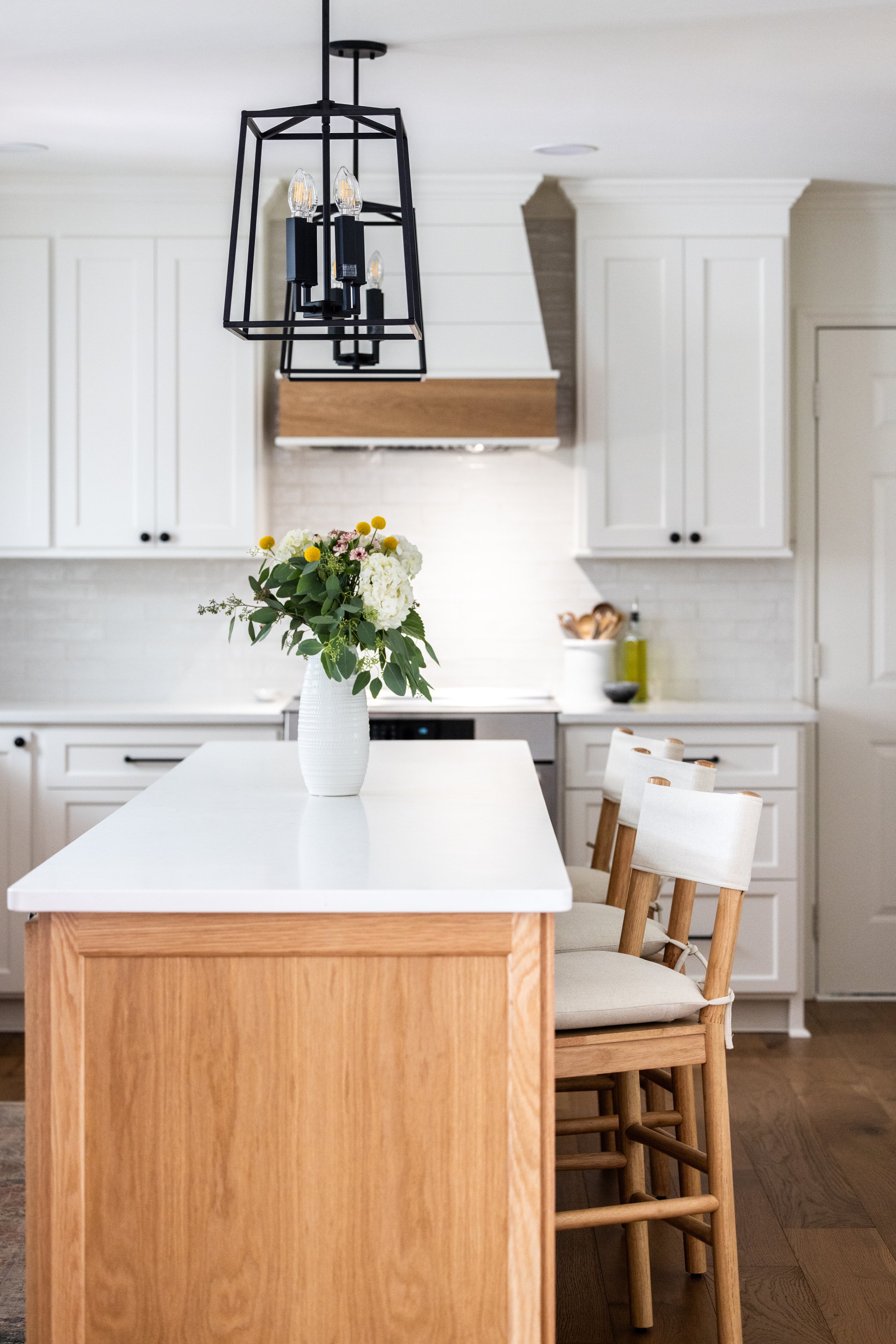
Antique Ivory: This soft, pale ivory adds a touch of antique charm to your kitchen. It's perfect for creating a timeless look that evokes a sense of elegance. We love the contrast of this kitchen remodel’s cabinets in Sherwin-Williams’ Natural Linen with a natural wood island for a timeless look.
Transitional kitchens blend the best of both traditional and modern design elements, creating a harmonious balance between classic and contemporary. Here are some neutral cabinet color ideas for a transitional kitchen:
Greige (Gray-Beige): Greige cabinets offer the versatility of both gray and beige. They can be a perfect bridge between the warmth of traditional design and the clean lines of modern aesthetics. See this Warm Gray Kitchen Remodel for inspiration!
Soft Gray: Soft gray cabinets provide a neutral backdrop that complements various design elements. They add a touch of sophistication to transitional kitchens. Check out this transitional kitchen in Sherwin-Williams’ Repose Gray if you’re looking for a light gray, almost white, paint selection.
Muted Green-Gray: A muted green-gray can bring a sense of tranquility to your kitchen. It's a perfect choice if you want to infuse a subtle, earthy tone into your transitional space. Evergreen Fog is so popular for its earthiness and versatility that it was named the Sherwin-Williams 2022 Color of the Year!
2. Observe Natural Light:
The amount and direction of natural light in your kitchen will play a significant role in how a paint color will appear. Here's what we recommend:
Kitchens with abundant natural light accommodate a broader range of colors. Cool neutrals like pale gray or off-white can shine beautifully without appearing gloomy.
In kitchens with limited natural light, consider slightly warmer neutrals to prevent the room from feeling cold and stark. Warm grays or creamy whites will evoke a cozier atmosphere.
3. Coordinate with Existing Features:
To ensure a cohesive and harmonious look, your kitchen's other permanent accents, such as backsplash and countertops, should guide your choice of paint color:
If your kitchen has light surfaces, you have the freedom to select nearly any neutral color. However, just like paints, tile and countertops also have undertones that could be the difference between a cohesive look and a disjointed space.
In kitchens with natural wood accents, opt for neutral shades that complement the undertones of the wood. Warm-toned wood pairs well with beige or light tan, while cooler wood works with gray or cool beige.
If talk of undertones and pairings makes you break a sweat, don’t worry. Ashmore Builders has a design team that will walk you through your selections every step of the way. Read more about our design-build process here.
4. Sample Paint Colors in Your Space:
Always test paint colors directly in your kitchen before making a final decision. Paint several choices you like on your walls to see how they interact with the lighting and existing elements. Make sure to observe the colors at different hours of the day to ensure that you are making a choice that compliments your space at any time of day.
Visit your local hardware store for paint samples, or order online direct from the paint manufacturer. Third party companies like Samplize will send you peel and stick sample straight to your door.
5. Determine the Desired Mood:
The mood you wish to create in your kitchen should influence your paint color selection:
For a serene and calming atmosphere, consider a soft, muted neutral like the pale greenish-blue of Sherwin-Williams’ Sea Salt.
To create a bright and airy space, opt for crisp whites or light grays that make the room feel open and spacious. Benjamin’s Moore’s Chantilly Lace and White Dove are popular choices for their crisp, yet chameleon-like way of lightening any room.
If you want a cozier, more intimate ambiance, select warm neutrals such as taupe or creamy beige. Sherwin-Williams’ Agreeable Gray is a go-to pick, and top seller year after year for it’s ability to fluctuate between a soft taupe and light gray depending on the lighting.
Kitchen Gallery
A “Mindful Gray” Transitional Kitchen Remodel
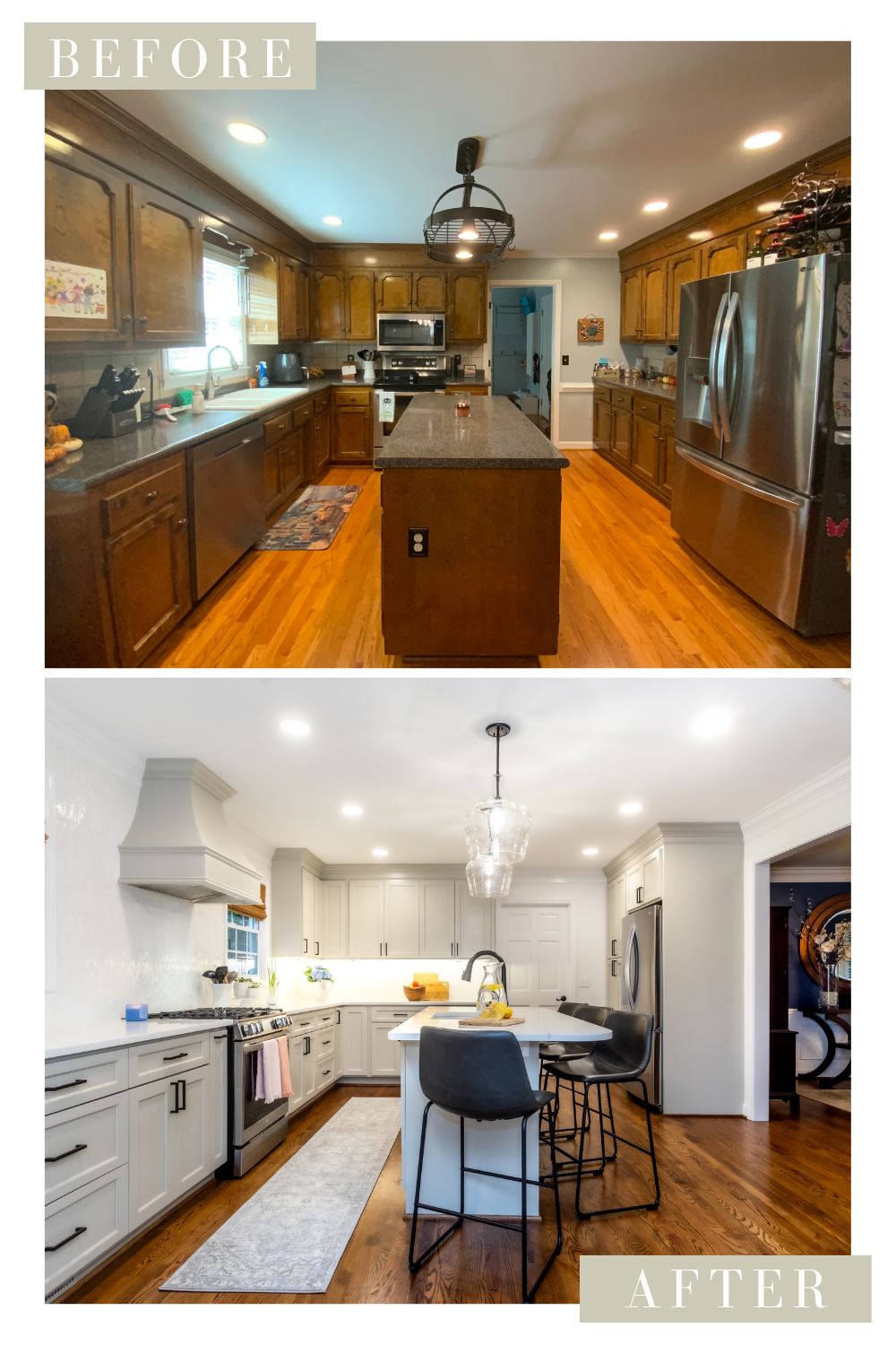
Our clients approached us with an eat-in kitchen whose dark and dated cabinetry left the space feeling gloomy; despite the space receiving ample natural light. Our team got to work designing a balanced kitchen that would offer plenty of storage, facilitate an efficient workflow, and open the interior floor plan– all while offering a neutral slate for the rest of the home.
Creating a Functional and Balanced Layout:
It took several rounds of drawings and meetings with our design team before our clients landed on their final floor plan. They had two “musts” in their design:
Open up the doorway between the kitchen and dining room
The island had to have enough seating for four people.
You don’t have to follow us for very long to know that incorporating a large, central island and knocking down walls are our forte. However, the challenge lay in creating a visually balanced space that facilitated a functional, day-to-day workflow. The design team came up with three solutions to optimize our client’s kitchen:
Create Symmetry
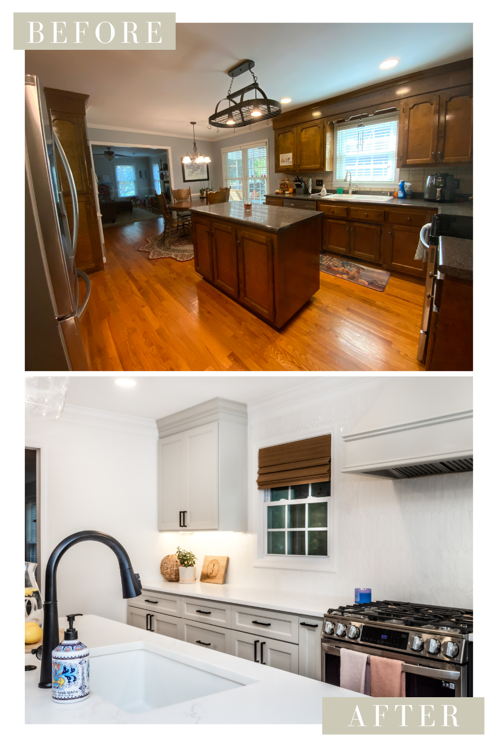
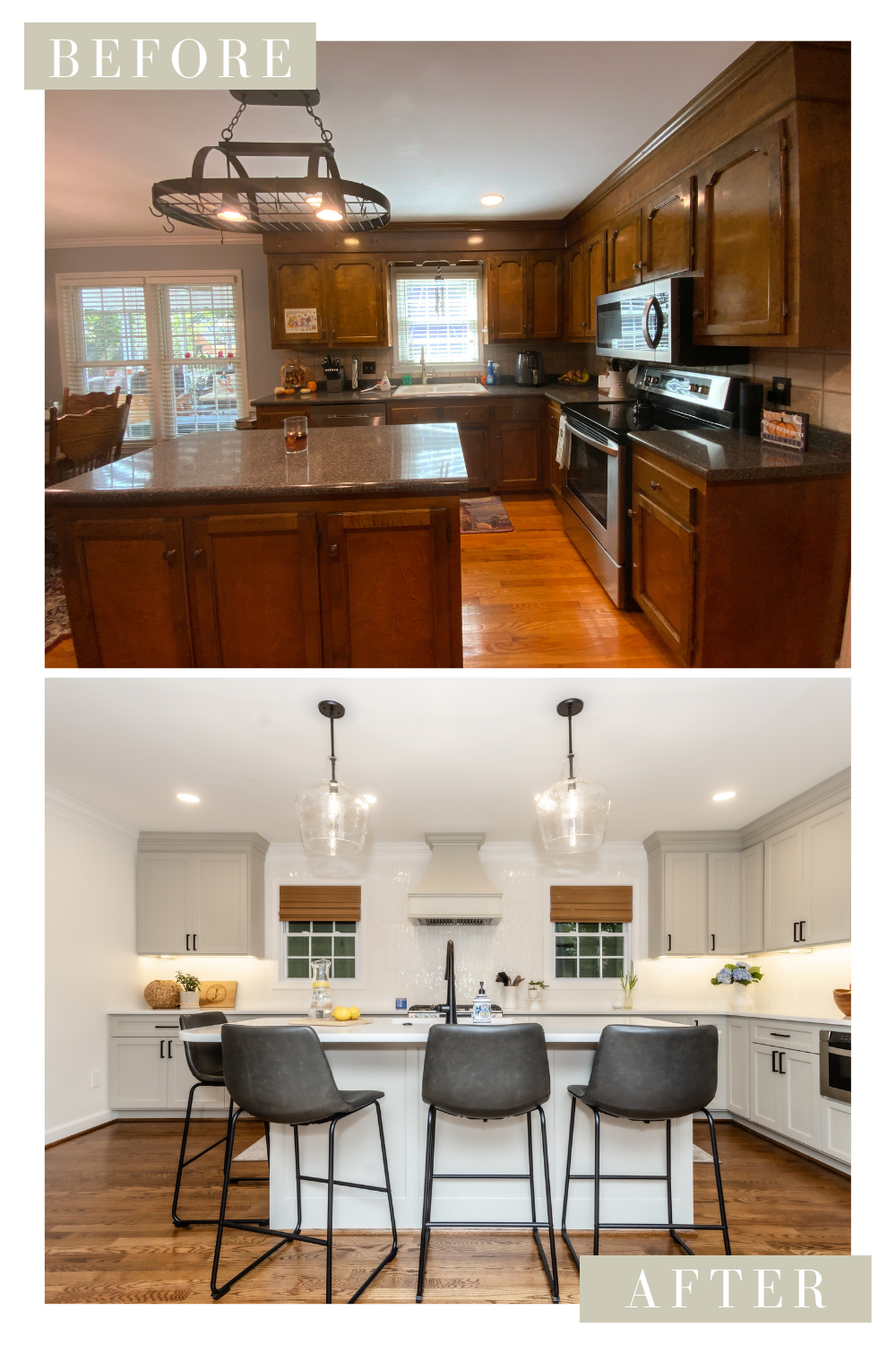
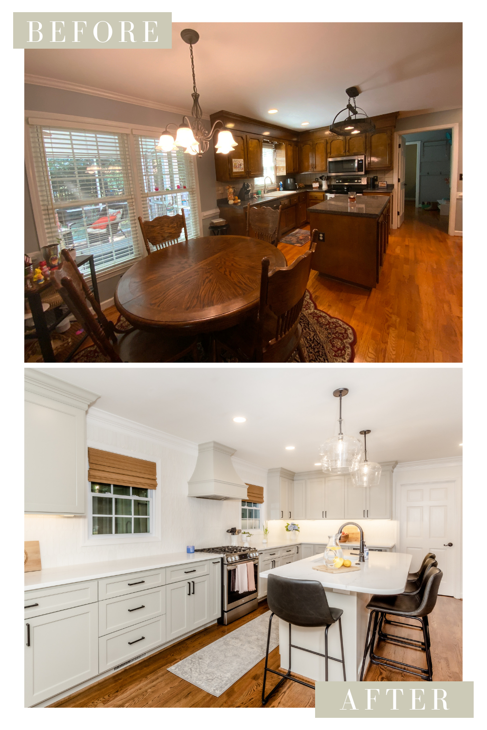
The clients were hesitant about the large breakfast nook window appearing out of place without a table in front of it. Our design team responded by creating a layout that replaced the large window with a smaller one that’s identical to the existing that was over the sink.
In the previous layout, the kitchen’s cabinets stopped abruptly in the middle of the back wall to accommodate the breakfast nook’s large window and table. In the new layout, the cabinets span the entire width of the kitchen. The cook range and hood were then placed in between the two windows to balance the space and break up the long wall of cabinetry.
Relocate the Sink
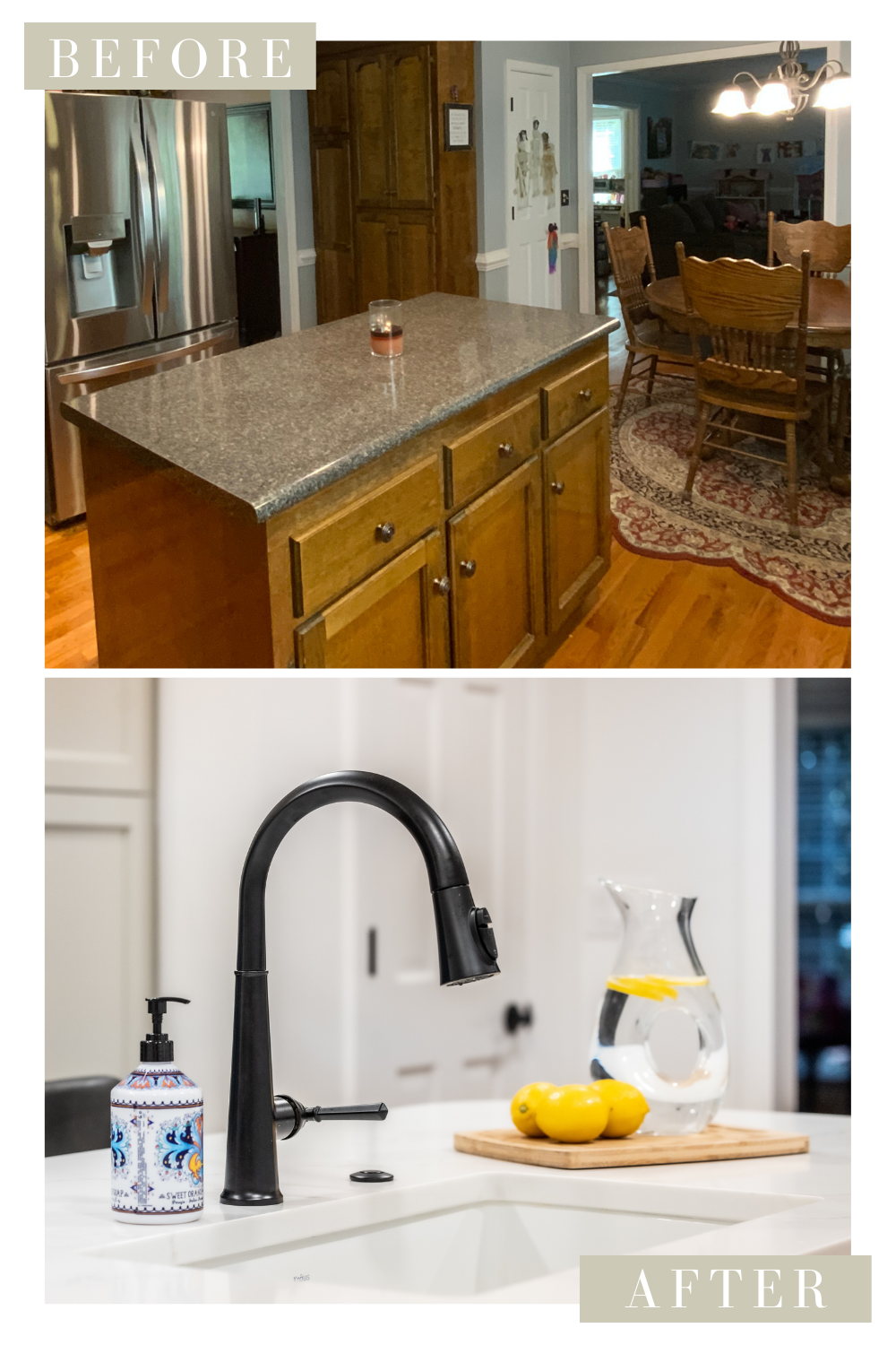
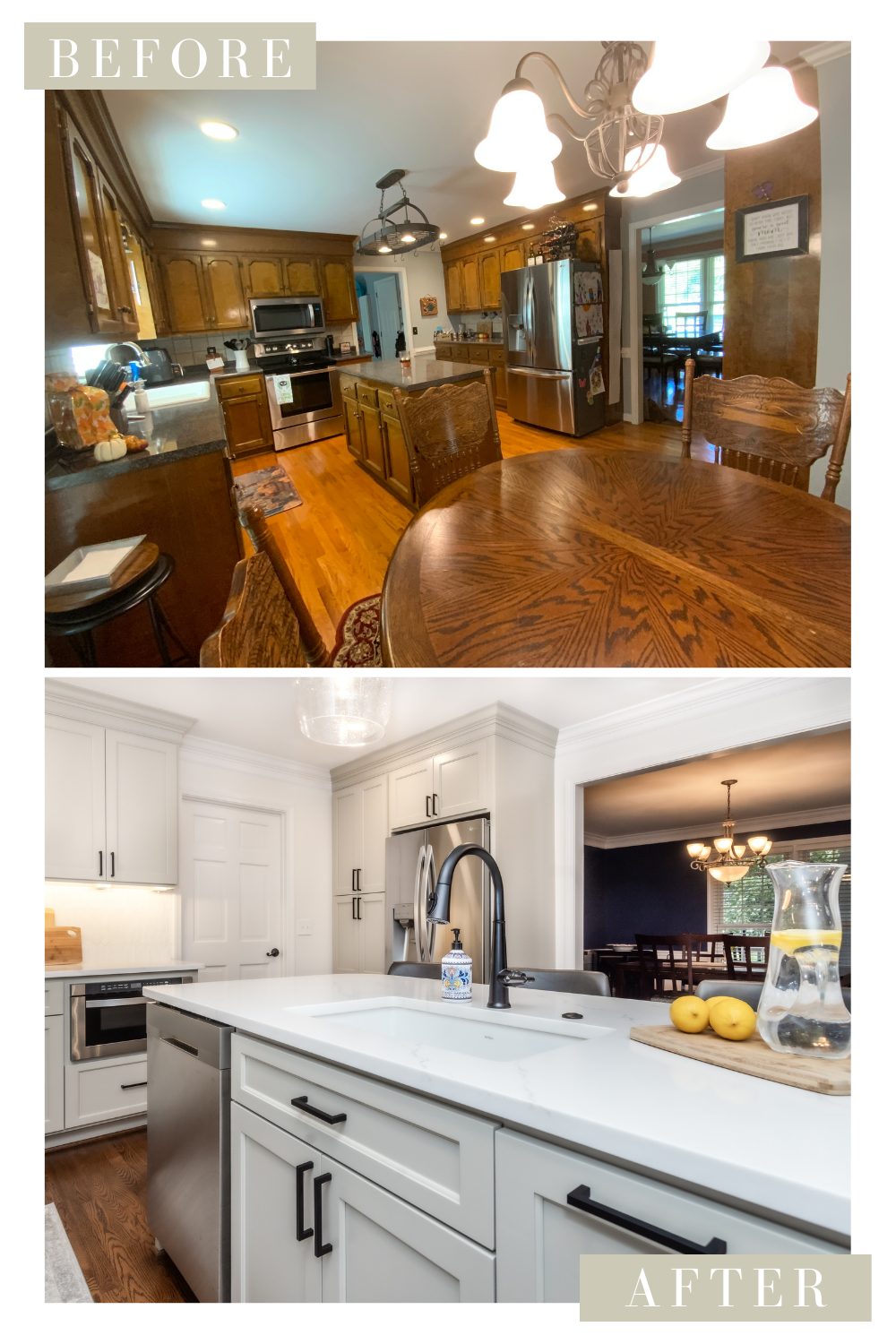
In the original layout, the sink was located under the smaller window. The newly remodeled kitchen has the sink placed in the center of the island with the dishwasher installed to the left. This creates an efficient work zone by having the cook range, sink, and dishwasher all within arm’s reach. Not to mention, it facilitates conversation with those seated at the island.
Slide the Fridge to the Left
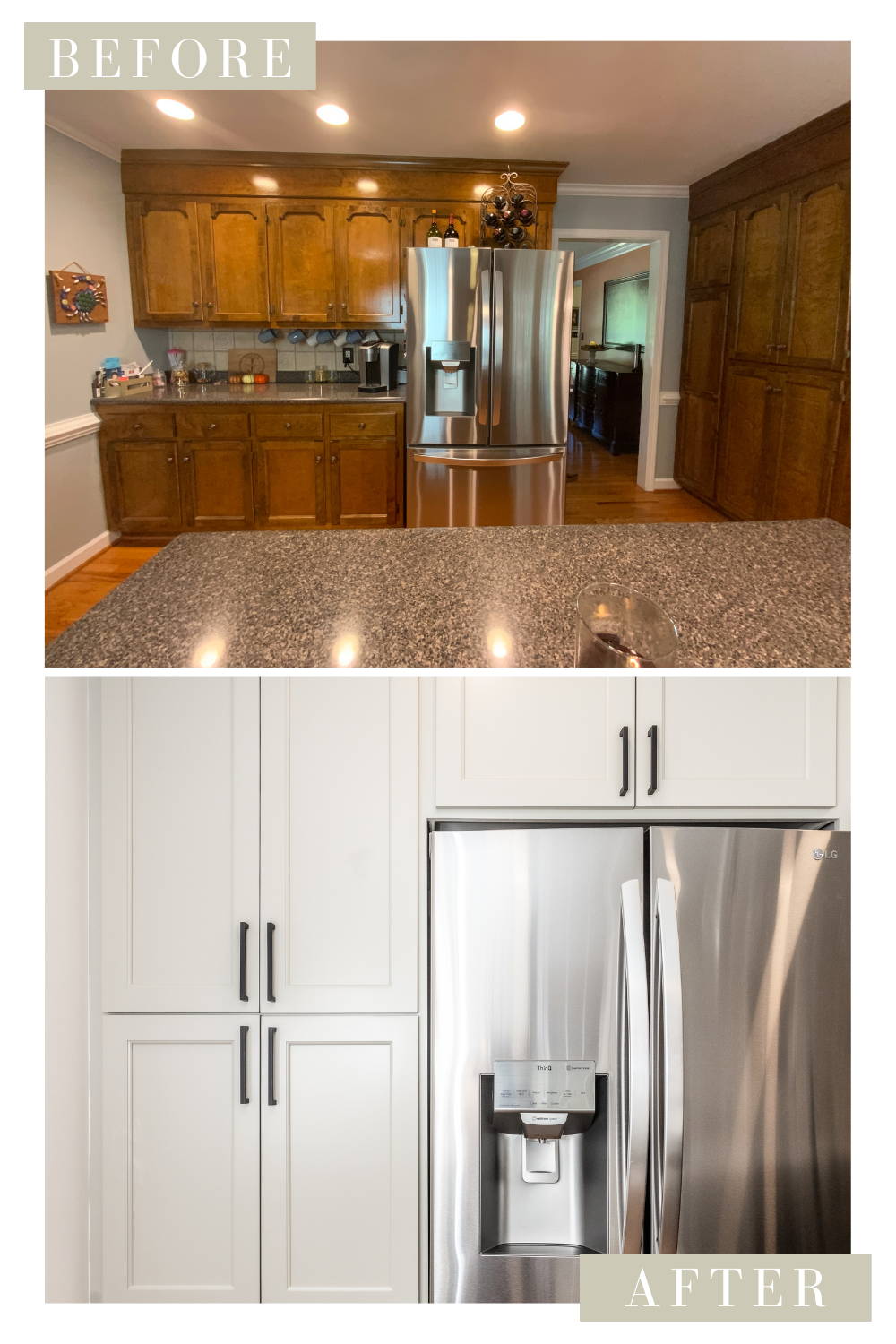
The original layout had the refrigerator placed in a wall of cabinetry that backed up to the formal dining room. Even though our team opened up the doorway, our clients didn’t lose any storage space or functionality.
Opening up the doorway cut the wall’s cabinetry space in half. However, the original, dated upper and lower cabinets were replaced by custom, floor-to-ceiling cabinetry that offers enough space for a pantry and the refrigerator. Despite losing wall space, our clients aren’t lacking any storage. Not to mention, the kitchen and dining room now blend seamlessly.
Kitchen Remodel Before and After
Implementing a Neutral, Transitional Style
Our clients not only wanted an updated look, they also wanted sufficient seating and storage to accommodate their family. As a family owned, and operated company, we understand the investment that our clients are making- not just in their homes, but also in the well-being of their families. That’s why we strive to deliver high-quality renovations that not only improve the look and value of the home, but also provide a space that will serve our clients and their families for years to come as their needs and stages of life change.
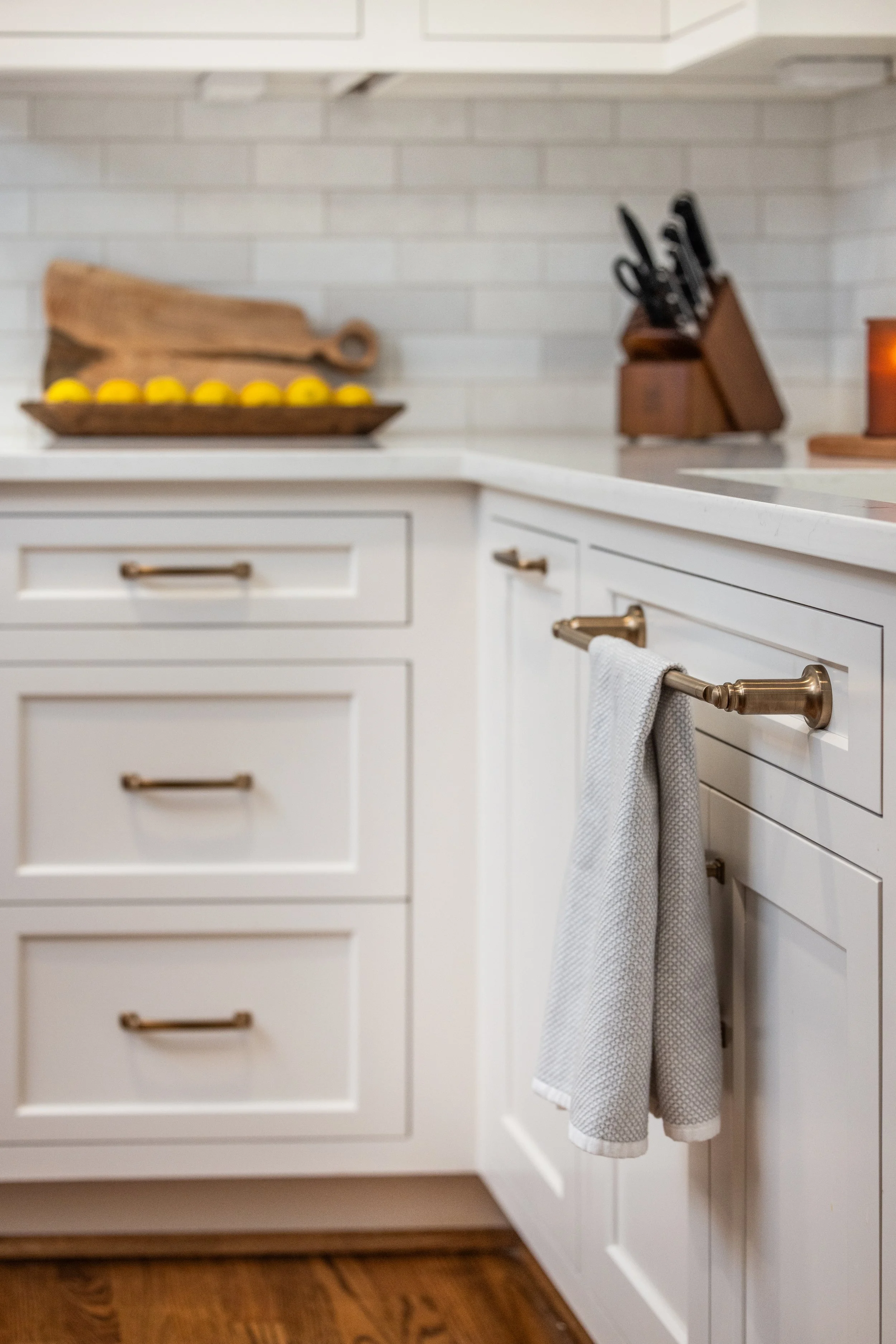
Our clients opted for a transitional style for their renovation that is sure to hold up to changing trends. This kitchen remodel features a timeless neutral color palette, custom cabinetry with a classic door profile, and contemporary fixtures and finishes.
Neutral Color Palette:
Our clients opted to paint their cabinets in Mindful Gray (SW 7016). The warm gray pops against the kitchen’s cool white walls painted Snowbound (SW 7004). Both Sherwin Williams colors sit in the top 10 of the company’s Top 50 Colors list for interiors, and for a good reason!
These timeless neutrals’ gray undertones provide just enough color to keep whichever space they are placed in from appearing too stark, but aren’t gray enough to cast a gloomy feel.
Classic Cabinetry Offering Sufficient Storage:
The original kitchen’s dark stained cabinets and curved door profile dated the space. Our clients chose a classic door profile with a subtle beading detail to soften the stark, squared-off edges associated with Shaker-style cabinetry.
Contemporary Finishes:
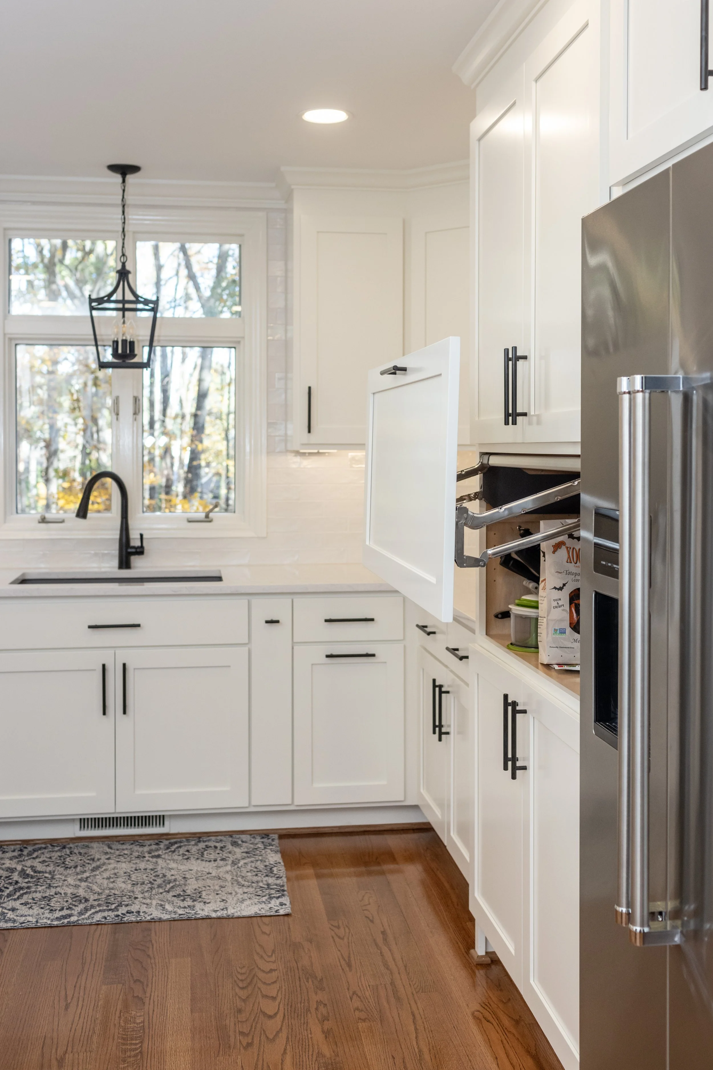
The kitchen’s classic, neutral color scheme gets a contemporary pop through the geometric lines found in the backsplash’s white picket tile, as well as matte black fixtures and accessories.
The kitchen’s picket tile backsplash, placed in a vertical stack pattern, offers a modern touch to this neutral kitchen remodel. Continuing the backsplash to the ceiling creates a cohesive look, and in addition, incorporates subtle texture and movement for light to reflect off of.
Matte black finishes and accessories further integrate a contemporary feel to this neutral kitchen renovation. The matte black finish on the cabinet pulls and plumbing fixtures not only adds a sophisticated touch, it also hides fingerprints and is easy to clean! Perfect for this busy, young family’s high-traffic kitchen.
This neutral transitional kitchen is a great example of a balanced, and timeless space. Our design team tweaked the previous layout to create a kitchen that is optimized and functional for our clients’ family. The kitchen’s neutral color scheme and classic cabinetry is balanced by a contemporary picket tile backsplash and chic, yet low maintenance, matte black finishes. The combination of classic silhouettes with contemporary finishes results in an optimized, transitional style kitchen that provides a neutral, yet stylish focal point for our clients’ home.
In this blog post, we've explored how to select the best neutral paint color for your kitchen remodel considering various kitchen styles, levels of natural light, and existing features; as well as the importance of sampling paint colors in your space, and the role of color in achieving the desired mood for your kitchen. Additionally, we've walked you through the transformation of a transitional kitchen in Sherwin-Williams’ Mindful Gray. We highlighted the renovation’s design process, and how our team pulled off creating a balanced and functional space with classic and contemporary elements. The result is a timeless, neutral kitchen that serves as a stylish focal point for the home. Whether you're looking for a modern, traditional, or transitional design, this guide provides you with valuable insights to make your kitchen remodeling project a success– offering our preferred choices of neutral paint selections and plenty of photos for inspiration throughout!
Selections
Photos by Kim Deloach Photography.
Paint:
Kitchen cabinets and island are painted Mindful Gray (SW 7016).
Kitchen walls and trim are Snowbound (SW 7004).
Dining room walls are painted Van Deusen Blue (HC-156).
Surfaces:
Tile selected through Clayton Tile.
2” x 9” white, glossy picket tile by Tile Factory Outlet, Switch On Collection.
Polished “Inspiration” Quartz sourced from Upstate Granite Solutions.
Fixtures and Accessories
Emmeline Faucet in matte black by Delta.
Harney 14” wide single light pendant by Signature Hardware in matte black finish.
Cabinet pulls by Atlas Homewares in matte black finish


